
Safety Signage Design: Best Practices & Compliance Tips
Let's be honest, when you think about signage for your business in Melbourne, your mind probably jumps to eye-catching 3D business signage or vibrant retail signage solutions designed to attract customers.
But what about the signs that protect them? Safety signage is the unsung hero of your operational space. It’s not just a regulatory box-ticking exercise; it’s a critical layer of communication that prevents accidents, guides behaviour, and demonstrates your commitment to everyone's wellbeing.
So, how do you transform a mandatory sign into an effective, instantly understandable tool? It’s a blend of art and science. As your local experts in professional signwriting services across Melbourne, we’ve distilled our knowledge into these essential design tips.
Why Clear Signage is a Non-Negotiable for Your Business
Think of your safety signs as the ever-vigilant members of your team. In a bustling commercial kitchen, a clear "Wet Floor" sign can prevent a serious slip. In a Medical Clinic, correct installation of fire exit directional signs can save lives during an emergency.
For a gym or fitness centre, proper equipment usage symbols ensure members train safely. Beyond the obvious human cost, ignoring safety compliance can lead to hefty fines, increased insurance premiums, and a damaged reputation.
Getting it right from the start isn’t just prudent; it’s paramount.
The Core Principles of High-Impact Safety Sign Design
Creating a safety sign that people actually notice and understand requires a strategic approach. It’s more than just slapping some text on a board.
Let's break down the core elements.
- Colour & Contrast: The Universal Language
Colour is the first thing the human brain processes, long before it reads a word. Leveraging universally recognised colour codes is your first step to instant comprehension.
- Red for Prohibition & Danger: Use for "Stop," "Do Not Enter," or "Fire Equipment." It commands immediate attention and signals a hazard.
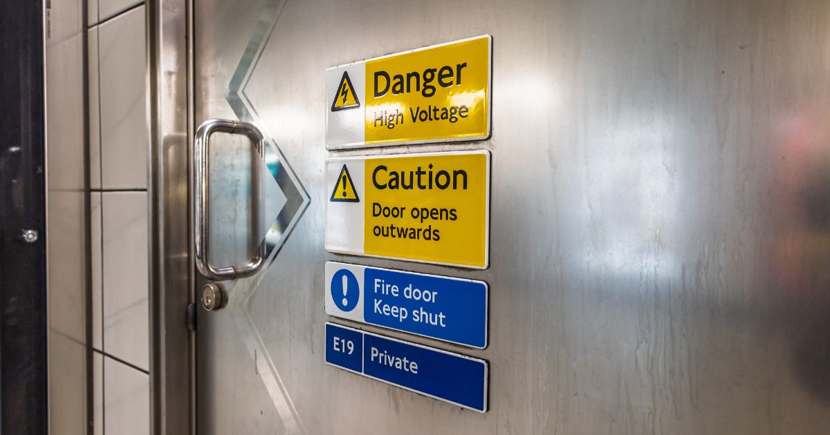
- Yellow/Amber for Warning: Indicates a potential risk. Think "Caution," "Mind Your Step," or "Hazardous Area."
- Blue for Mandatory Action: Specifies a behaviour that must be followed, such as "Wear Safety Goggles" or "Keep Fire Door Closed."
- Green for Safe Conditions: Shows the location of safety equipment, first aid kits, and emergency exits.
The key is high contrast. A yellow triangle with a black symbol is far more legible from a distance than pastel colours. This principle applies whether you're using digitally printed signage, lightboxes and neon signs for 24/7 visibility, or durable materials for vehicle signage designs.
- Clarity & Legibility: Choosing the Right Font and Size
If people can't read it, the sign has failed. Your font choice and size are critical.
- Font Choice: Always opt for clean, sans-serif fonts like Arial, Helvetica, or Verdana. Avoid elaborate, script, or serif fonts that can be difficult to decipher in a split second. The goal is clarity, not calligraphy.
- Font Size: Size should be proportional to the viewing distance. A sign that needs to be read from 10 metres away requires a much larger font than one viewed from 2 metres. A simple rule? The further the distance, the bigger the text. This is a crucial consideration for wayfinding signs for businesses in large warehouses in Tullamarine or sprawling medical centres in Bundoora.
- The Power of Symbols: Transcending Language Barriers
A well-designed symbol can convey a message faster than any paragraph of text. In a multicultural hub like Melbourne, where your staff and customers may speak a variety of languages, symbols are essential.
Use internationally standardised pictograms. A flame for fire risk, a stylised person running for an emergency exit, or a hand with a drop of liquid for mandatory handwashing. These symbols break down language barriers and ensure your message is universally understood.
Practical Application: Tailoring Safety Signs to Your Industry
Safety signage isn't one-size-fits-all. Let's look at some local examples:
- For Cafés and Restaurants: "Hot Surface" signs near coffee machines, "Caution: Slippery Floor" for kitchen ingress/egress, and clear allergen icons on food display units are vital.
- For Hair and Beauty Salons: Signs indicating sterilisation procedures, wet floor warnings at wash basins, and clear exit routes are a must.
- For Gyms and Fitness Centres: Proper weightlifting instruction symbols, pool depth markers, and emergency stop signs on equipment are crucial for member safety.
- For Daycare Centres: Child-friendly safety signs with clear symbols for "Slow Down," "Wash Hands," and emergency assembly points provide peace of mind for parents and staff.
Conclusion: Partner with Experts for Peace of Mind
Designing for safety compliance is a serious responsibility, but it doesn't have to be a daunting one. By mastering the fundamentals of colour, clarity, and symbols, you can create a safer environment for your employees, customers, and visitors.
Whether your project requires simple window film signage for a café door, comprehensive wayfinding signs for businesses in a warehouse, or specialised government signage projects, the principles of effective design remain the same.
At Alpha Lewis Signs, we don't just manufacture signs; we provide end-to-end signage consultancy and business signage solutions tailored to the unique needs of Melbourne businesses.
Let us help you ensure your safety signage is not only compliant but truly effective. Protect your people, protect your business, and do it with signage that speaks volumes.


